

Uber and Careem, two giants in the ride-hailing industry, have significantly reshaped transportation in the UAE and several other countries. While Uber, founded in 2009 in San Francisco, expanded globally, Careem, established in 2012 in Dubai, focused on the Middle East, North Africa, and South Asia regions. In 2019, Uber acquired Careem, marking a pivotal moment in their competitive dynamics and user experience strategies.
Both companies have established a strong presence in the region, offering convenient and reliable transportation solutions to millions of users. But with so much competition, how do their user interfaces (UI) and user experiences (UX) stack up against each other? This blog gets into a comparative screen analysis of Uber and Careem, dissecting their strengths and weaknesses to see which app is supreme in the UX arena.
Key Takeaways
- Uber prioritizes simplicity and efficiency, while Careem integrates localized features and services tailored to regional preferences.
- Uber offers straightforward navigation with global consistency, whereas Careem enhances usability with Arabic support and localized services.
- Both apps provide multiple payment methods; Careem includes localized options like bill payments, catering to diverse financial practices
- Developing a clone app like Uber or Careem requires focusing on core features, user-friendly design, localization, rigorous testing, and strategic marketing for successful market entry.
UX Screen Analysis: Uber
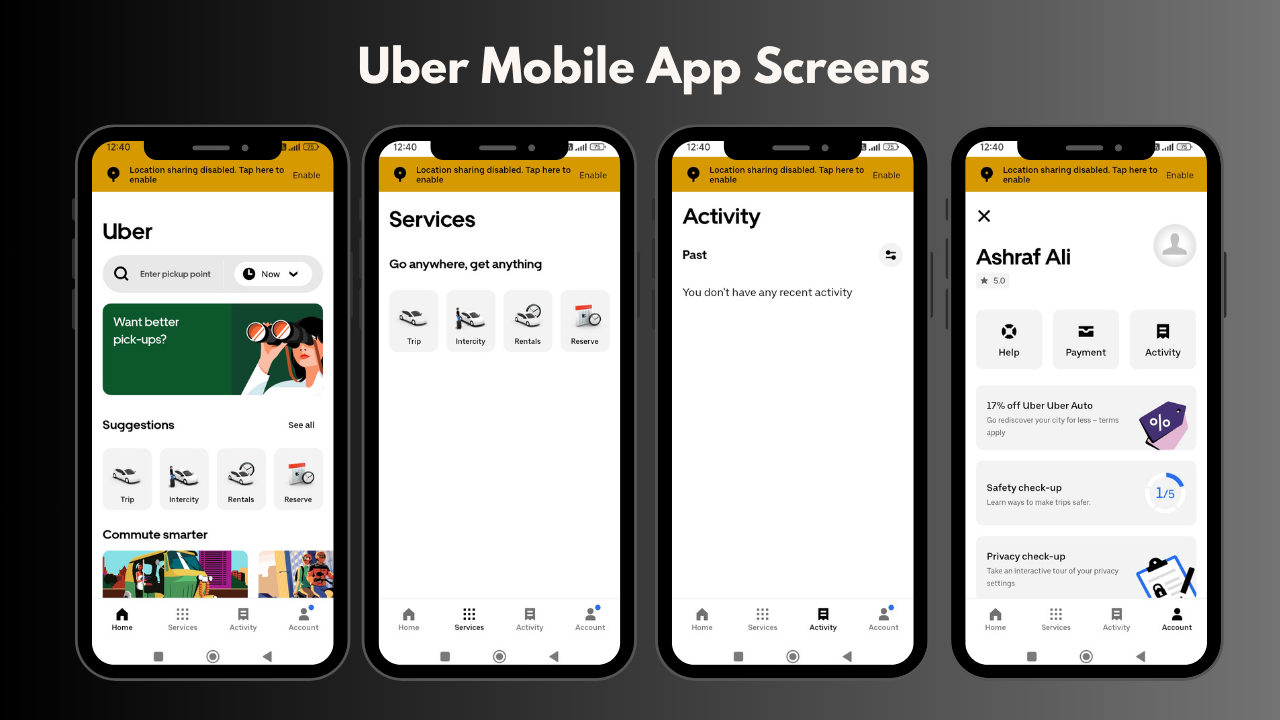
Uber changed how we get around cities by making it easy to summon a ride with a simple app. Uber's business success story hinges on a user-friendly design that's straightforward, fast, and keeps you informed in real-time. Let's take a look at Uber's main screens and see how each part helps you book a ride, give feedback, and adjust your settings.
Home Screen
The Uber home screen serves as the central hub for user interactions. It features a map interface for seamless location input and ride selection. Clear call-to-action buttons for ride types and fare estimates enhance usability, ensuring quick navigation and efficient booking processes.
Services
In the services screen, Uber presents users with a range of options personalized to their needs, such as trips, intercity, and more. Each service is accompanied by brief descriptions and pricing details, optimizing user decision-making by providing clear and accessible service differentiation.
Activity
The activity screen offers users an overview of their ride history, including details such as trip routes, fares, and driver ratings. Filters and sorting options enable users to easily locate specific trips, providing transparency and accountability within the platform.
Account
Uber's account screen acts as a personalized dashboard where users manage payment methods, review account settings, and access support features. It integrates seamlessly with the app's navigation, ensuring intuitive access to critical user information and enhancing overall account management efficiency.
Driver Tracking
During a ride, Uber's driver tracking screen displays real-time updates on the driver's location and estimated time of arrival (ETA). Interactive maps with route visualization and dynamic ETA adjustments ensure users stay informed and engaged throughout their journey, enhancing trust and satisfaction.
Payment
Uber's payment screen facilitates seamless transactions by presenting users with multiple payment options, including credit cards, digital wallets, and promotional codes. Clear prompts for adding new payment methods and reviewing transaction histories optimize user control and convenience.
Ratings and Feedback
After each ride, Uber's ratings and feedback screen allows users to rate their experience and provide feedback. User-friendly interfaces with predefined rating scales and optional comment fields promote user engagement and improve service quality through actionable insights.
UX Screen Analysis: Careem
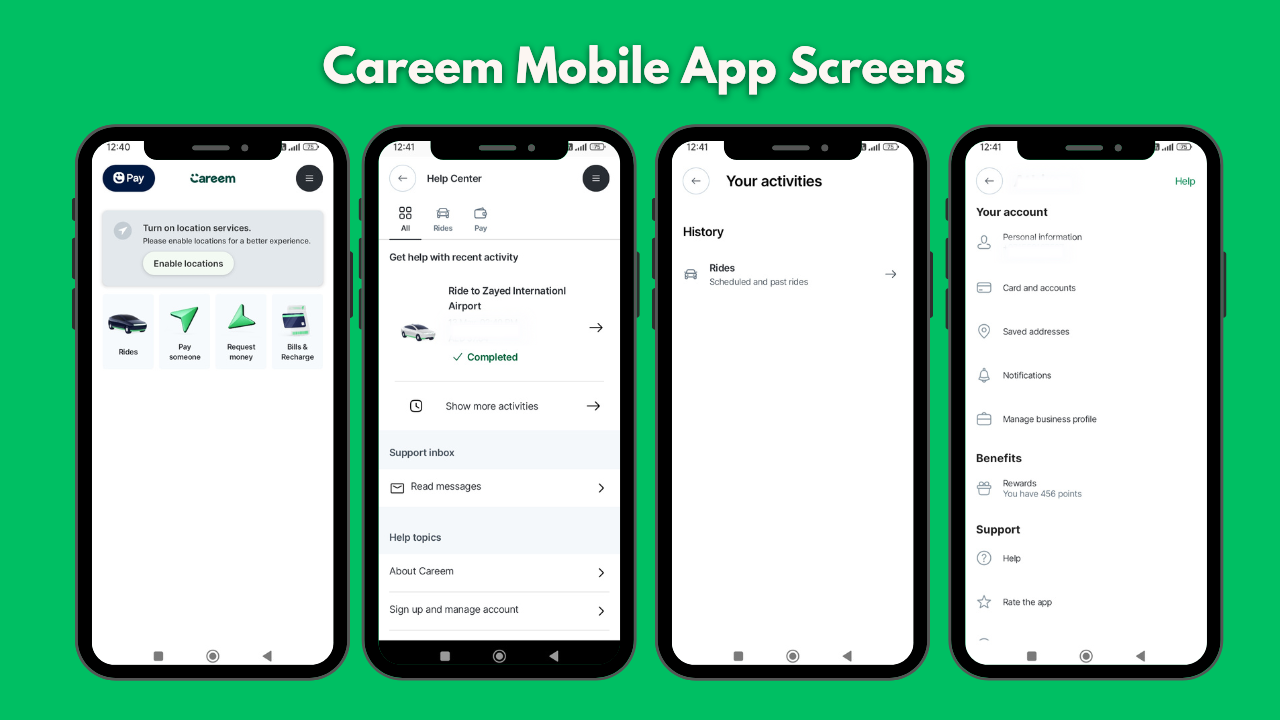
Careem has simplified travel throughout the Middle East with its versatile mobile app. Apart from ride-hailing, Careem offers various user-friendly services that cater to personal preferences. This analysis explores Careem's standout mobile app strategies, detailing how its app screens assist users in booking rides, managing accounts, accessing help, and tracking activities, all aimed at making daily tasks more convenient.
Home Screen
Careem's home screen serves as a dashboard offering multiple functionalities beyond ride-hailing. It features options to book rides, pay someone, request money, and manage bills & recharges. Clear icons and intuitive layout ensure seamless navigation and quick access to essential services, enhancing overall user convenience.
Help Page
The help page in Careem's app provides users with support options and FAQs. It includes searchable topics, categorized assistance articles, and direct contact methods for customer support. Clear navigation and accessible help resources ensure users can resolve issues quickly, improving overall satisfaction and reducing friction in user interactions.
Your Activities
Careem's activities screen offers users a detailed overview of their past rides, transactions, and service interactions. It includes filters for sorting by date, type of activity, and payment method used. This organized layout enables users to easily track and manage their history, offering transparency and accountability within the app.
Your Account
Careem's account screen acts as a centralized hub for managing personal information, payment methods, and security settings. It provides options to update profiles, add or remove payment cards, and set preferences such as notification settings. User-centric design elements ensure navigation and efficient account management, enhancing overall user control and satisfaction.
Driver Tracking
During a ride, Careem's driver tracking screen displays real-time updates on the driver's location, estimated time of arrival (ETA), and route details. Interactive maps with live tracking and dynamic ETA adjustments ensure users stay informed and engaged throughout their journey, enhancing trust and satisfaction.
Payment
Careem's payment screen offers users multiple payment options, including credit cards, digital wallets, and localized payment methods. It features prompts for adding new payment methods, viewing transaction histories, and managing recurring payments. Secure and user-friendly interfaces streamline transactions, ensuring convenience and reliability for users.
Ratings and Feedback
After each ride, Careem's ratings and feedback screen allows users to rate their experience and provide feedback. It includes predefined rating scales and optional comment fields, facilitating quick feedback submission. This user-centric approach helps improve service quality and enhances user engagement by encouraging active participation in service improvement.
Comparative Analysis: Uber vs Careem
Home Screen Design: Uber keeps it simple with quick access to ride options and fares. Careem’s home screen is busier but practical, integrating ride-hailing, bill payments, and money transfers for easier multitasking.
User Navigation: Uber’s icons and prompts are straightforward for booking and managing rides. Careem adds Arabic support and local services, making navigation intuitive for Middle Eastern users.
Payment and Transactions: Both offer multiple payment options, but Careem includes local methods and bill payments, accommodating diverse financial practices.
Functionality: Uber focuses on core ride-hailing with global consistency. Careem expands functionality with integrated services like deliveries, catering to regional needs and enhancing everyday convenience.
Design Aesthetics: Uber opts for minimalist design for universal appeal. Careem blends practicality with localized aesthetics, ensuring familiarity and usability across diverse cultural contexts.
Customer Support: Uber provides global support options, while Careem offers localized help in Arabic, meeting regional needs effectively.
Innovation: Uber focuses on global tech upgrades, Careem innovates by customizing features like deliveries to regional preferences, enhancing user engagement and convenience.
How to Develop a Clone App like Uber and Careem?
Now that we have seen the UX screens of Uber and Careem, let's see how to develop a clone app like Uber and Careem. Start by outlining your app's core features, a user-friendly interface for booking rides, real-time driver tracking, secure payment systems, and robust customer support. Choose a reliable tech stack and consider using platforms like Google Maps for accurate location services. Develop a backend that handles user data, ride requests, and payments securely.
Design the app with simplicity in mind, ensuring easy navigation and clear call-to-action buttons. Implement features like ratings and feedback to enhance user engagement and service quality. Localize your app by offering language options and integrating regional payment methods for wider accessibility.
Testing is important to identify and fix bugs before launching. Ensure compliance with local regulations and prioritize user safety with features like emergency assistance and driver background checks. Finally, promote your app through targeted marketing campaigns and partnerships with local businesses.
Developing a clone app like Uber and Careem involves distinct advantages compared to custom app development, particularly in making use of existing successful models and user familiarity.
Conclusion
Uber and Careem represent contrasting approaches to UX design within the ride-hailing industry. While Uber emphasizes global consistency and efficiency, Careem’s strategy revolves around cultural adaptation and localized user engagement. Understanding these differences not only sheds light on their respective successes but also underscores the importance of user-centric design in creating impactful digital experiences.
For businesses aiming to tap into the ride-hailing market's potential, Way2Smile Solutions can be your go-to partner. We specialize in providing clone app development solutions, customized to reflect your brand identity and cater to your specific target audience. With our expertise in UX design and development, we ensure your clone app development idea not only meets but exceeds user expectations, delivering a seamless and enjoyable experience comparable to Uber and Careem.